Assignment Overview
In this project you will design a full professional web presence in a way that will allow you to continue to add to and revise the site into the future. Your site should be designed according to HTML5, CSS 1 and 2, and Web Standards, which includes designing it according to all usability and accessibility guidelines we started implementing in the first project. It should also be designed in terms of the ideas and theories on Emotional Design (Walter). The final should include:
- a bold, eye-catching, and unique front page that reveals a personalty for the site and visually tells a story of who you are (we will be doing this as a class using 3 different full-screen images, one dedicated for each screen: phone, tablet, computer);
- a design informed by the design persona you created (though you are welcome to update your design components based on how you think your portfolio turned out);
- a design that includes your name and navigation on every page
- clear navigation and a footer (footer on all pages except index.html);
- an about page with a personal statement that includes your Why? How? and What statements,
as well asand if you would like, a link to download a PDF version your resume or vita (if adding a resume, remove your address, email address, and phone number — you don’t want random contacting you); - a portfolio with at least 4 portfolio items with relevant technical information
- you can maintain your portfolio design from the first project, revise it slightly, or revise it significantly
- a contact page that includes a form designed at WuFoo
For this project, you must have at least 3 CSS documents that work together in concert with your HTML pages:
- main.css, which you started using for your portfolio, and will be used on all pages except your home page
- imagehome.css which will ONLY contain your index.html page styling
- nav.css, which will ONLY contain your navigation styling but will be applied to all your pages
Your stylesheets should prepare your pages to be viewed on at least 3 screen sizes, but you might find that you want to add the 1024px that we used in your portfolio:
@media screen and (min-width: 320px) /* phone portrait view */

@media screen and (min-width: 768px) /* tablet portrait view */

@media screen and (min-width: 1024px) /* computer landscape view */
In your imagehome.css file, which is just for your index.html page, the third media query is:
@media screen and (min-width: 1280px) /* computer landscape view */
For more advanced designs and more control over your layouts on multiple devices, I recommend using the breaking points in the View Responsive Layouts heading (under the Resize heading) in the Web Developer Toolbar. I also suggest using the Screen Sizes web site to see phone, tablet, and computer screen sizes. Each screen must contain (at least slightly) different style properties.
Templates (to be used with 4/15 homework)
There are 3 templates for this project, each of which you should modify for your own images, styles, and tastes. To get the template, click on each of the below links, copy the whole code, paste it into a NEW Brackets file, and save using the names and extensions below in the appropriate folder (e.g. css files in your styles folder).
Home Page Images
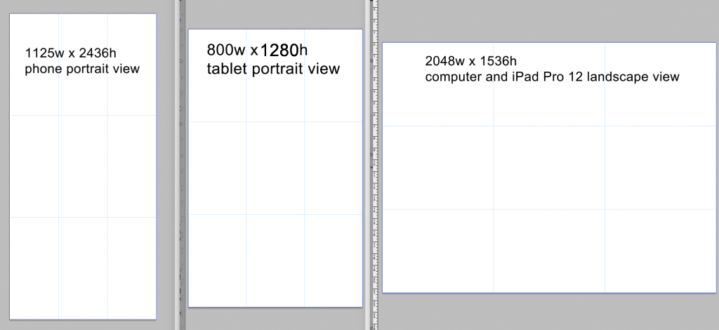
For this project you are required to use THREE DIFFERENT images for each of the three screens you will be styling for: phone, tablet, and computer. Though there are 100s of devices with varying screen sizes, I’ve worked hard to suggest sizes that will work on nearly all the screens your web site could be viewed on. The sizes YOU MUST use are:
- phone (portrait view): 1125 width x 2436 height (72 resolution)
- tablet (portrait view): 800 width x 1280 height (72 resolution)
- computer and iPad 12 (landscape view): 2048 width x 1536 height (72 resolution)
You will notice that we are coding the portrait views only on the phone and tablet. You are welcome to try to code for the landscape views, too, by creating additional media queries. But, that will get in to some very complex coding that can boggle the mind. The better route is to find an image that you can live with being viewed in the landscape views on those devices.
Because you never know what device your web page will be viewed on, you can never code for all possibilities. The best you can do is try to code for as many as possible. Sizing your images like this and using the templates will help you do that.
Assignment Specifics
Your pages must:
- Display appropriately (though not necessarily exactly the same) in Firefox, Safari, Chrome, Opera, and Internet Explorer 8+ (IE)
- Use responsive web design techniques (e.g., media queries, scaleable images, flexible layouts) to display on mobile, tablet, and desktop devices
- Have a consistent emotional design
- Use GoogleFonts or AdobeFonts instead of computer defaults
Your HTML5 must:
- Use the HTML5 doctype
- UTF-8 character encoding
- Use valid HTML5 structural tags (e.g., header, section, nav, figure) and
class/idattributes - Have a meaningful .html name in all lowercase letters with the main page name being index.html (such as, about.html, portfolio.html, contact.html, etc.)
- Include meaningful closing </div> comments (and other comments where necessary), such as <!– end left –>
- Remove all no-longer needed closing / on self closing elements.
- Included a <footer></footer> on all pages but index.html.
- Include accessibility features, such as
ALTandTITLEelements on images and links,aria-labelfor background images,LONGDESCelements and files when you determine it necessary, closed captions or transcriptions to all videos, and so on - Validate against the HTML5 and Wave accessibility Validation sites
Your CSS documents must:
- Be built over the top of a reset CSS file, such as Eric Meyer’s CSS Reset
- Use valid CSS 1 and 2 selectors, properties, and attributes
- Include comments for all math
- Be loaded into your HTML5 pages via the
<link>tag in the head area (no inline styles via thestyle=""attribute or embedded in the head with the<style>tag) using the appropriatemediaattribute value. - Validate against the CSS and Wave accessibility Validation sites
Project Goals:
- Establish a solid and sound representation of yourself and your skills, based on your career or field of study/area of expertise
- Organize and style your professional site using responsive design techniques for maximum rhetorical effect under particular viewing conditions (desktop/laptop, smartphone, tablet)
- Learn to prepare and organize appropriate materials to represent yourself on the web using theories on Emotional Design
- Learn to design a site in terms of Web Standards, including putting usability and accessibility at the forefront of your designs, as well as integrating sustainable design techniques
- Learn to use CSS to control the layout and design of HTML5 pages, using grid-based design methods for layout and typography
Going Beyond What is Required
If you would like to take a risk and try more advanced techniques so you can beyond what is required, some you might consider are:
- designing one of your pages using parallax scrolling (see the code for an example page Bill created)
- adding meta descriptions to your pages to have more detailed search results listing
- adding Google Analytics code to your code, which provides page view statistics
- incorporating a customized CSS-based image carousel (there are pure javascript carousels, so please avoid them)
- custom styling your 404 error message (this could be a super fun and creative design)
- creating a case study that walks readers through your design process
- creating multiple pages for types of portfolio items (such as, photography.html, graphics.html, etc.)
- embedding relevant social media, such as Instagram posts, using widgets
- creating custom styles for your WuFoo contact form that matches your site styles (colors, fonts, etc.)
- replacing the full-screen images on index.html with looping gifs or videos coded using HTML5
- code media queries for each of the screen break points in the Web Developer Toolbar “View Responsive Layouts” tool: 320, 480, 600, 768, 800, 1024
- or anything else you want to try out!
Due Dates
4/17 – 4/22: Rough Draft of Full Site due before your individual meeting that week
TBD: Final Draft of Full Site Due by 11:00pm
This assignment is informed by a similar assignment created by Karl Stolley.